 |
| Figure 1. Correlation Coefficient and Significance of Distance and Sound Level. |
 |
| Figure 2. Graph of Sound Level vs. Distance. |
The null hypothesis states that there is no linear relationship between distance and sound level. The alternative hypothesis states that there is a linear relationship between distance and sound level. For this data set, the null hypothesis is rejected because the significance level is .000 (see figure 1). This means that there is a linear relationship between distance and sound level. This can be seen in figure 2 which shows a negative correlation between sound level and distance. As sound level decreases, its distance increases.
Part 2: Correlation Continued
 |
| Figure 3. Correlation Matrix for Milwaukee |
People who were below the poverty line were primarily black and Hispanic (positive correlation). There was a strong negative correlation of people below the poverty line and both whites and those educated in college. There is a strong negative correlation between the percentage of all races (white, black, Hispanic). Throughout the matrix, there is an overwhelming trend that shows that percent white have the opposite correlation in comparison to percent black and percent Hispanic correlations. The walking data is only significantly related to people below poverty level.
Part 3: Spatial Autocorrelation
Introduction:The Texas Election Commission (TEC) has asked for the Hispanic populations of 2010, voter turnout from 1980 and 2008 as well as the percent voting democratic in 1980 and 2008 to be analyzed for patterns. The data used in this analysis were obtained from the US Census online. The analysis will be conducted using GeoDa (Local Indicators of Spatial Autocorrelation-LISA and Moran's I). GeoDa will be used to analyze spatial autocorrelation. Spatial autocorrelation is the correlation of a variable with itself through space. The SPSS correlation matrix was used as another mean in which to analyze the data. Correlation measures the association between pairs of variables. This test can measure the direction (positive, negative, or null) and strength of the relationship (-1 being the most negative, 1 being the most positive, and 0 being null).
Methods:
In order to run the tests, census data needed to be downloaded off of the US Census website. From here, an Excel document of the data and the Texas state/counties shapefile was used in ArcMap. The spreadsheet and shapefile were joined and then exported as a shapefile, which is what GeoDa requires to be able to perform a spatial autocorrelation test.Two specific spatial autocorrelations have been conducted in this analysis. Spatial autocorrelation is the correlation of a variable with itself through space. This correlation is important because it differs from the tests based on the central limit theorem, so the output looks different. Moran's I is one of the two test that was run. This test compares values from one area to another. The output graph is determined by how similar or different the data is from one another through space. The upper right quadrant shows high, high (+,+) which means high value areas surrounded by other high areas. Just the opposite is low, low (-,-) which shows low value areas by other low value areas. In between are low, high (-,+) and high, low (+,-) quadrants which indicate values in between the low, low or high, high quadrants.
Local Indicators of Spatial Autocorrelation (LISA) was the spatial autocorrelation test that was run for this analysis. LISA is different from Moran's I in that its output shows a map of the area analyzed, which allows for a great visualization to gain a better spatial understanding. This test functions in a very similar way to Moran's I.
Both of these tests are found in GeoDa, which is a program designed for geospatial analysis through open source software tools.
Results:
The graph and map for percentage of Hispanic population 2010 shows a strong positive correlation. The clustering of points is primarily located in the low, low quadrant. In the map, it can be seen that the low, low quadrant from the map is primarily located in north eastern Texas. As there are more clusters in the low, low quadrant, there are also more counties that are associated with the low, low significance.
 |
| Figure 4. Moran's I Percent Hispanic population 2010. |
 |
| Figure 5. LISA cluster map Percent Hispanic population 2010 . |
 |
| Figure 6. Moran's I % Voting Democratic 1980. |
 |
| Figure 7. LISA cluster map percent voting democratic 1980. |
Regarding the voter turnout in 1980, the graph and map both indicate that there is a mediocre difference regarding the spatial autocorrelation throughout the state (see figures 8 and 9). This means that there were a few significant spatial areas in which voter turnout was high (northern and central Texas) and areas in which the turnout was low (eastern and southern Texas). The large area of white counties depicts where there was no significant difference in the relationship between people voting and not voting.
 |
| Figure 8. Moran's I Voter turnout 1980. |
 |
| Figure 9. LISA cluster map voter turnout 1980. |
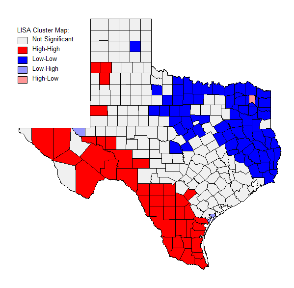
The percentage of people voting democratic in 2008 was interesting in that there was a very spread out high, high quadrant, but the low, low quadrant had many more points in a small region right along the trend line (see figures 10 and 11). As seen in the map, the majority of the counties during 2008 did not stand out as being significant. However, there is a very clear divide that shows the difference between voting trends in the north and the south. The north was overwhelmingly a low correlation (Republican or other) and the south was primarily an area of high Democratic voting. Relating back to the percent Hispanic map (see figure 5), there is a strong pattern between the areas in which there are high percentages of Hispanic people and a high percentage of people voting Democratic.
 |
| Figure 10. Moran's I % Voting Democratic 2008. |
 |
| Figure 11. LISA cluster map percent voting democratic 2008. |
The voter turn out in 2008 was the weakest correlation out of any of the test that were run for this analysis. This can be seen in the vast 'insignificant' counties throughout Texas. The southern tip of Texas is the most significant area in the state with a low, low area. This can be further seen in the few and spread out points in the low, low region quadrant. Interestingly, this is a similar map to the one from 1980 (see comparative figures below).
 |
| Figure 12. Moran's I Voter turnout 2008. |
 |
Figure 13. LISA cluster map voter turnout 2008.
|
|
| Comparative Figure- Voter Turnout 1980 |
|
| Comparative Figure- Voter Turnout 2008 |
Overall there are some trends that are apparent between the almost 30 year difference in polling. The southern part of Texas has had traditionally lower rates in voter turnout than the north. The southern and eastern parts of Texas tend to vote Democratic. The correlation matrix for the Texas data was performed in SPSS to see if there was any significant relationships between variables. For example, there is a strong positive correlation between percent Hispanic and percent voting Democratic in the 2008 presidential election. In addition, the percent Hispanic negatively correlate with voter turn out in 2008. This backs up the data from GeoDa stating that it is likely that Hispanics will vote Democratic, and areas where there are high percentages of Hispanics generally have lower voter turnout.
 |
| Figure 14. Correlation Matrix for Texas Election Data. |
Conclusion:
Both types of tests done with the spatial autocorrelation (Moran's I and LISA) help in creating a better picture in which to analyze data. Having the components of both the graphs and the maps develop a more complete understanding with the data presented. It is not surprising that all of the graphs created in this assignment were positive. This relates to Tobler's law which states that "everything is related to everything else, but near things are more related than distant things." Because nearer things are more similar to each other, there is a greater chance that spatial autocorrelation will show groupings of similarly valued variables.
No comments:
Post a Comment