Wednesday 29 April 2015

Lab 4: Regression Analysis

Part 1:

Null Hypothesis: There is no linear relationship between free lunches and crime rates.
Alternative Hypothesis: There is no linear relationship between free lunches and crime rates.

Y= 21.819+1.685x

79.7=21.819+1.685x                    x= 34.4%

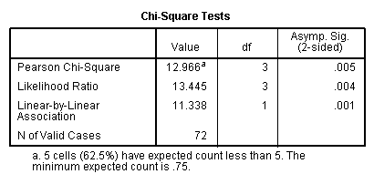
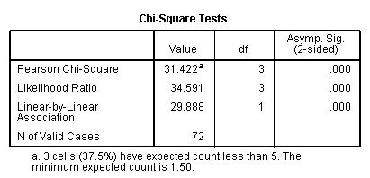
At a .005 significance level, the null hypothesis is reject, stating that there is a relationship between free lunches and crime rates. However, the R square value is .173, meaning that 17.3% of the time, free lunches explain the crime rates. Meaning that there is a weak significant correlation between crimes rates and free lunches. Although this output can be used to help explain the relationship between the two variables, its lack of a strong R square value means that the analyst of the data should be wary of making solid correlations from this data.


Figure 1. Linear Regression analysis between free lunches and crime rates.
Part 2:

Introduction:

For this lab the focus was the University of Wisconsin System. The class was asked to analyze two schools, Eau Claire and another one, to see how the demographics vary across the state. Only the residents from Wisconsin are figured into these calculations. From comparing two different schools, it can be determined if the dynamics across the state vary from school to school.

Methods:

In order to calculate the regression between the two variables SPSS needed to be run in order to see if the two variables were significant at the .05 significance level. All but one of the six set of variables were significant (see figures 2 through 11) below.

The null and alternative hypotheses are as follows:

Null: There is no significant linear relationship between the two variables.
Alternative: This is a significant linear relationship between the two variables.

From here the excel document was exported to ArcMap and then used in a choropleth map for visualization of the output.

Results:

The figure and map below (figures 2 and 3) show that the relationship between Eau Claire Enrollment vs. Percentage of County with a Bachelor's Degree are significant. However, according to the R square value of .121, the relationship is very weak, meaning that one should not rely on the relationship to be true. According to the map, Eau Claire county is the highest valued county in the state.

Figure 2. Eau Claire enrollment and Percent Bachelor's Degree
Figure 3. Map of Eau Claire Enrollment vs % of County with a Bachelor's Degree.

The figure and map below (figures 4 and 5) show that the relationship between Eau Claire Enrollment and County vs. Population Distance are significant. In the map there are clearly defined areas in which the enrollment is high across the state. These include highly populated regions like Green Bay, as well as counties such as Marathon, Dane, and Waukesha.
Figure 4. Eau Claire enrollment and distance to Eau Claire.

Figure 5. Map of Eau Claire Enrollment vs County Population and Distance.
The figure and map below (figures 6 and 7) show that the relationship between Stevens Point Enrollment vs. Percentage of County with a Bachelor's Degree are significant. The R square value is really low, meaning that the relationship, although there is one, is very weak and these results should not be used to predict future outcomes.

Figure 6. Stevens Point enrollment and Percent Bachelor's Degree


Figure 7. Map of Stevens Point enrollment vs % of County with a Bachelor's Degree
The figure and map below (figures 8 and 9) show that the relationship between Stevens Point Enrollment vs. Median Household Income are significant. However, the R Square value is quite low, meaning that the relationship is quite reliable and likely to happen.


Figure 8. Stevens Point enrollment and median household income
Figure 9. Map of Stevens Point Enrollment vs Median Household Income

The figure and map below (figures 10 and 11) show that the relationship between Stevens Point Enrollment vs. County and Population Distance are significant. The R Square value at .801 is very high, meaning that the relationship between the two variables is quite reliable.

Figure 10. Stevens Point Enrollment and distance to Stevens Point.

Figure 11. Map of Stevens Point Enrollment vs County Population and Distance


Something that stood out from the Stevens Point maps was concentration of enrollment in combination with the distance from Stevens Point. This shows that Stevens Point has a large number of students attending their own university. Other than the two main county concentrations of students enrolled in the university, Green Bay is also drawn to attending Stevens Point.

For the variables Eau Claire enrollment and median household income, we fail to reject the null hypothesis, stating that there is no significant linear relationship between Eau Claire enrollment and median household income.

Conclusion:

The fact that all of the Stevens Point linear regressions were significant says that Stevens Point has a certain type of people that go to school there. This generally means that they have similar incomes, and do not come from southern or western Wisconsin.

It would be interesting in a future study to increase the states observed in this study to Minnesota and Illinois. I know that many students that attend Eau Claire are from Minnesota, and being that Stevens Point is closer to Illinois, it would be interesting to see how the linear regression would work with those additional states in consideration.

Thursday 9 April 2015

Lab 3: Correlation and Spatial Autocorrelation

Part 1: Correlation


Figure 1. Correlation Coefficient and Significance of Distance and Sound Level. 


Figure 2. Graph of Sound Level vs. Distance.

The null hypothesis states that there is no linear relationship between distance and sound level. The alternative hypothesis states that there is a linear relationship between distance and sound level. For this data set, the null hypothesis is rejected because the significance level is .000 (see figure 1). This means that there is a linear relationship between distance and sound level. This can be seen in figure 2 which shows a negative correlation between sound level and distance. As sound level decreases, its distance increases.

Part 2: Correlation Continued

Figure 3. Correlation Matrix for Milwaukee


People who were below the poverty line were primarily black and Hispanic (positive correlation). There was a strong negative correlation of people below the poverty line and both whites and those educated in college. There is a strong negative correlation between the percentage of all races (white, black, Hispanic). Throughout the matrix, there is an overwhelming trend that shows that percent white have the opposite correlation in comparison to percent black and percent Hispanic correlations. The walking data is only significantly related to people below poverty level.


Part 3: Spatial Autocorrelation

Introduction:The Texas Election Commission (TEC) has asked for the Hispanic populations of 2010, voter turnout from 1980 and 2008 as well as the percent voting democratic in 1980 and 2008 to be analyzed for patterns. The data used in this analysis were obtained from the US Census online. The analysis will be conducted using GeoDa (Local Indicators of Spatial Autocorrelation-LISA and Moran's I). GeoDa will be used to analyze spatial autocorrelation.  Spatial autocorrelation is the correlation of a variable with itself through space. The SPSS correlation matrix was used as another mean in which to analyze the data. Correlation measures the association between pairs of variables. This test can measure the direction (positive, negative, or null) and strength of the relationship (-1 being the most negative, 1 being the most positive, and 0 being null).

Methods:

In order to run the tests, census data needed to be downloaded off of the US Census website. From here, an Excel document of the data and the Texas state/counties shapefile was used in ArcMap. The spreadsheet and shapefile were joined and then exported as a shapefile, which is what GeoDa requires to be able to perform a spatial autocorrelation test.Two specific spatial autocorrelations have been conducted in this analysis. Spatial autocorrelation is the correlation of a variable with itself through space. This correlation is important because it differs from the tests based on the central limit theorem, so the output looks different. Moran's I is one of the two test that was run. This test compares values from one area to another. The output graph is determined by how similar or different the data is from one another through space. The upper right quadrant shows high, high (+,+) which means high value areas surrounded by other high areas. Just the opposite is low, low (-,-) which shows low value areas by other low value areas. In between are low, high (-,+) and high, low (+,-) quadrants which indicate values in between the low, low or high, high quadrants.

Local Indicators of Spatial Autocorrelation (LISA) was the spatial autocorrelation test that was run for this analysis. LISA is different from Moran's I in that its output shows a map of the area analyzed, which allows for a great visualization to gain a better spatial understanding. This test functions in a very similar way to Moran's I.

Both of these tests are found in GeoDa, which is a program designed for geospatial analysis through open source software tools.

Results:

The graph and map for percentage of Hispanic population 2010 shows a strong positive correlation. The clustering of points is primarily located in the low, low quadrant. In the map, it can be seen that the low, low quadrant from the map is primarily located in north eastern Texas. As there are more clusters in the low, low quadrant, there are also more counties that are associated with the low, low significance.
Figure 4.  Moran's I Percent Hispanic population 2010.
Figure 5. LISA cluster map Percent Hispanic population 2010 .
Out of any of the graphs produced for this analysis, the percentage voting democratic in 1980 is the most equally distributed throughout between low, low and high/ high and low, and high variable correlations. Northern Texas appears to be an area of low Democratic voting, whereas the southern and eastern parts of Texas primarily voted Democratic.

Figure 6. Moran's I % Voting Democratic 1980.
Figure 7. LISA cluster map percent voting democratic 1980.
Regarding the voter turnout in 1980, the graph and map both indicate that there is a mediocre difference regarding the spatial autocorrelation throughout the state (see figures 8 and 9). This means that there were a few significant spatial areas in which voter turnout was high (northern and central Texas) and areas in which the turnout was low (eastern and southern Texas). The large area of white counties depicts where there was no significant difference in the relationship between people voting and not voting.

Figure 8. Moran's I Voter turnout 1980.
Figure 9. LISA cluster map voter turnout 1980.

The percentage of people voting democratic in 2008 was interesting in that there was a very spread out high, high quadrant, but the low, low quadrant had many more points in a small region right along the trend line (see figures 10 and 11). As seen in the map, the majority of the counties during 2008 did not stand out as being significant. However, there is a very clear divide that shows the difference between voting trends in the north and the south. The north was overwhelmingly a low correlation (Republican or other) and the south was primarily an area of high Democratic voting. Relating back to the percent Hispanic map (see figure 5), there is a strong pattern between the areas in which there are high percentages of Hispanic people and a high percentage of people voting Democratic.

Figure 10. Moran's I % Voting Democratic 2008.
Figure 11. LISA cluster map percent voting democratic 2008. 

The voter turn out in 2008 was the weakest correlation out of any of the test that were run for this analysis. This can be seen in the vast 'insignificant' counties throughout Texas. The southern tip of Texas is the most significant area in the state with a low, low area. This can be further seen in the few and spread out points in the low, low region quadrant. Interestingly, this is a similar map to the one from 1980 (see comparative figures below).

Figure 12. Moran's I Voter turnout 2008.

Figure 13. LISA cluster map voter turnout 2008.
Comparative Figure- Voter Turnout 1980
Comparative Figure- Voter Turnout 2008

Overall there are some trends that are apparent between the almost 30 year difference in polling. The southern part of Texas has had traditionally lower rates in voter turnout than the north. The southern and eastern parts of Texas tend to vote Democratic. The correlation matrix for the Texas data was performed in SPSS to see if there was any significant relationships between variables. For example, there is a strong positive correlation between percent Hispanic and percent voting Democratic in the 2008 presidential election. In addition, the percent Hispanic negatively correlate with voter turn out in 2008. This backs up the data from GeoDa stating that it is likely that Hispanics will vote Democratic, and areas where there are high percentages of Hispanics generally have lower voter turnout.

Figure 14. Correlation Matrix for Texas Election Data.

Conclusion:

Both types of tests done with the spatial autocorrelation (Moran's I and LISA) help in creating a better picture in which to analyze data. Having the components of both the graphs and the maps develop a more complete understanding with the data presented. It is not surprising that all of the graphs created in this assignment were positive. This relates to Tobler's law which states that "everything is related to everything else, but near things are more related than distant things." Because nearer things are more similar to each other, there is a greater chance that spatial autocorrelation will show groupings of similarly valued variables.  

Monday 16 March 2015

Lab 2: Significance Testing and Chi Squared Test

Part 1 from assignment (no write up):

1.


2b: Below are all of the potential null and alternative hypotheses that could have been generated from the insects:


Null (Asian Beetle): there appears to be no difference between the number of Asian-Long Horned Beetles from the county level to the state level.


Alternative (Asian Beetle): there is a difference between the average number of Asian-Long Horned Beetles from the county level to the state level.


Null (Emerald Beetle): there appears to be no difference between the number of Emerald Beetles from the county level to the state level.


Alternative (Emerald Beetle): there is a difference between the average number of Emerald Beetles from the county level to the state level.


Null (Golden Nematode): there appears to be no difference between the number of Golden Nematodes from the county level to the state level.


Alternative (Golden Nematode): there is a difference between the average number of Golden Nematodes from the county level to the state level.

Here are the results after each z or t test:
  •  I reject the null hypothesis, which states that there is a difference between the average number of Asian-Long Horned Beetles from the county level to the state level. This is because the z-score was calculated to be -7.749 and the critical value was 1.96, which does not fit into the distribution graph.
Z score: (3.2-4)/(.73/sqrt. 50)= -7.749
  •  I reject the null hypothesis, which states that there is a difference between the average number of Emerald Beetles from the county level to the state level. This is because the z-score was calculated to be 9.246 and the critical value was 1.96, which does not fit into the distribution graph.
Z score: (11.7-10)/(1.3/sqrt. 50)= 9.246
  •  I reject the null hypothesis which states that there is a difference between the average number of Golden Nematodes from the county level to the state level. This is because the z-score was calculated to be 2.47 and the critical value was 1.96, which does not fit into the distribution graph.
Z score: (77-75)/(5.71/sqrt. 50)= 2.46

3a:

  • Null Hypothesis: There is no difference between the size of the party attending a wilderness park in 1960 and 1985.
  • Alternative Hypothesis: There is a difference between the size of the party attending a wilderness park in 1960 and 1985.
T- value: (3.4-2.1)/(1.32/sqrt. 25)= 4.924

3b. The corresponding probability value is 1.711 for a two tailed 95% confidence level.


Part 2:


Introduction/ Problem/ Research Question(s):

This lab's purpose was to determine whether 'Up North' in Wisconsin is truly different from the south. In this particular situation, Highway 29 that runs from east-west was used as the dividing line between the two halves. The null hypothesis for this lab is that the 'north' and 'south' have no significant difference in their variables. The alternative hypothesis is that there is a difference between the variables in northern Wisconsin than southern Wisconsin.

Methods

The first step was determining which counties belonged on the north/south region of the state. It was difficult to find a map with both county names and Highway 29, so a county labeled map of Wisconsin was created in ArcMap and imported into Adobe Illustrator. Then a state map with Highway 29 labeled was overlayed on the other map to then be able to see the county labels, and the highway location. For counties to be considered part of the 'north' they had to have at least 50% of the county boundary above the highway (see figure 1).


Figure 1. The North-South Divide. This determination was categorized based on the county in relation to Highway 29 which runs approximately east-west in almost the middle of the state.

The data that was used for this lab was obtained from the Statewide Comprehensive Outdoor Recreation Plan (SCORP), which contained data from the DNR including license data, demographics, and other variables that would relate to the outdoors and travel.

Three variables from individual data sets were used to see if there was a statistical difference between northern and southern Wisconsin. The variables that were chosen for this particular lab include forest acerage, cottages, and campsites.

Three new fields were created within attribute table to develop a clearer visualization of the spatial distribution of the data. By looking at the 'Statistics' under the original variable columns, the maximum county number of the variable was determined. This number was then taken and divided by four, which then allowed for four sub-categories to be created. This would later allow for a choropleth map to be made as well as give the ability to export the data into SPSS (a predictive analysis software program developed by IBM).

The Chi-Square value was calculated for all of the variables in SPSS. This allows for a comparison of an observed distribution to an expected distribution of frequencies.

Results

Campsites, for this dataset, are considered to be any type of campsite (see figure 2). There appears to be a fairly equal distribution of campsites throughout Wisconsin.

Figure 2. Campsites Per County.
This dataset fails to reject the null hypothesis, stating that there is not a difference between the number of campsites in northern and southern Wisconsin counties. At a 95% significance level, one would fail to reject the null hypothesis if the 'asymp sig.' is greater than .05, and because this particular 'asmp. sig.' is greater, then we fail to reject the null hypothesis (see figure 3). This is shown in the cross-tabulation table (see figure 4) which shows that there is not much of a difference between the expected and actual counts for the number of campsites. Lower central Wisconsin has the largest number of campsites in a concentrated area. It would be extremely interesting to see if there is a similar map output under the campground dataset.

Figure 3. Campsite Chi-Square.

Figure 4. Campsite Cross-tabulation.

Cottages, for this dataset, are considered seasonal homes. There are significantly more cottages in northern Wisconsin than southern Wisconsin according to the map (see figure 5).
Figure 5. Cottages Per County. 

This variable rejects the null hypothesis, stating that there is a difference between the number of cottages in the north and the south because the 'asymp. sig.' is less than .05 (see figure 6). According to the map, there are statistically more cottages in the north than the south. As seen in the cross-tabulation table (figure 7), the actual counts of cottages in the north exceeds the expected in the 'more cottages' columns (columns 2-4 in figure 7), but does not hit the expected count for the 'fewer cottages' column (see column 1 in figure 7).
Figure 6. Cottage Chi-Square.

Figure 7. Cottage Cross-tabulation.


This forest data was based on public and private forested land in acres. There is an obvious trend in this data that there is more forested land in the 'north' than the south.
Figure 8. Forest Acres Per County.
The null hypothesis is rejected for this data set according to the Chi-Square Test (see figure 9). This shows that there is a significant difference between the forest acreage between northern and southern Wisconsin. This is further indicated in the cross-tabulation table (see figure 10), which shows that the county for highly forested levels was much greater in the north than the south (see column 4 in figure 10). Because the expected and actual counts were so different, there is a significant difference between the two parts of the state according to forest acreage.
Figure 9. Forest Chi-Square. 
Figure 10. Forest Cross-tabulation.

Conclusion

Overall, I reject the null hypothesis stating that there is a difference between northern and southern Wisconsin. The Chi-Square values for the forest and cottages data indicate that there is a significant difference between northern and southern Wisconsin, where as the number of campsites did not seem to have a significant difference between the north and the south. This makes it difficult when there are only three variables to draw a conclusion from, and two of those reject the null hypotheses. With different variables, we could have failed to reject the null hypothesis, stating that there is no difference between northern and southern Wisconsin. 

Thursday 19 February 2015

Lab 1: Z-Scores, Mean Center, and Standard Distance

Introduction/Problem/Research Question/s:

There is a firm that has employed the help of geographers which requires the evaluation of the geography and distribution of tornadoes throughout Kansas and Oklahoma. The states would like to mandate a building of tornado shelters in areas where there have been a large number of tornadoes. However, there is an argument from some that they are unnecessary because of cost and likely lack of use in some areas. The goal is to locate areas that would be of high tornado probability and access whether shelters would be necessary. In addition, there will need to be a basis in which it is more appropriate to require the building of tornado shelters. This would include calculating statistics using the given files including tornado locations and their width and paying special attention to the patterns over time.

Methods:

There are four main tools used in analyzing the spatial data of tornadoes in Oklahoma and Kansas. The first is the mean center. This is the average of the x and y coordinates, which then creates a hypothetical point that displays the average place in which a tornado would occur. The second is a weighted mean center which takes into consideration the frequencies of the grouped data, in this case the width of tornadoes. Having this point allows one to see if there is a difference in mean centers and weighted mean centers. In some cases, the weighted mean could be more important than the mean center, but it is important to know both to have a better understanding of the spatial data presented.

Another tool is the use of standard distance. This is basically a spatial version of standard deviation. In ArcMap, one can choose how many standard deviations they want to display. In the case of this lab, only one standard deviation circled is shown. The closer a point is to the middle of this circle, the closer it is to the mean. An important note is that unlike regular standard deviation, standard distance cannot be negative.There is also a weighted standard distance that acts in a similar way to that of a weighted mean center. A map cannot have a weighted standard distance if it does not have a weighted mean center.


Results:

Map 1.a displays the mean and weighted center of tornadoes in Kansas and Oklahoma from 1995 to 2006. A mean center is displayed in pink, which shows where the average x and y coordinates are for the given data. There is also a weighted mean center that is based on the width of the tornado. This map shows that the larger tornadoes are located slightly farther south and west on the map. It is visible to the naked eye to see that there appear to be larger tornadoes in the southern region (depicted by the yellow graduated circles- the bigger circles being the larger tornadoes).


Map 1a. Depicts the mean and weighted center of Tornadoes in Kansas and Oklahoma from 1995 and 2006
After evaluating the maps, it was clear that there were a number of tornadoes mapped that had a tornado width of zero. Ergo, some of the points which appear to be small tornadoes, actually are not tornadoes at all. This led to the creation of map 1b., showing the same data as map 1, except after extraction of the tornadoes with a width of zero. The mean center moved slightly northward, indicating that there were more false tornadoes in the south. The weighted width mean center of the tornadoes did not change, however. Figure 1 shows the zoomed in view of map 1b. in the region of the mean centers, which gives a closer view of how the data is adjusted with and without the zero tornado width data.


Map 1b. This is the modified data that eliminated the tornadoes with a width of zero from the tornadoes from 1995 to 2006. The mean center is slightly adjusted from the data with the 0-1780 feet widths.  
Figure 1. Zoomed in view of the reconfigured '95-'12 tornadoes. When looking at the maps, it was realized that some of the widths for the tornadoes were zero, so when the data was reconfigured (taking out the tornadoes with zero width), there was a slight change in the mean center (the green and magenta circles), but no change in the weighted mean (the blue squares). There is a lack of change in the weighed data because the width of zero does not effect the weighted mean center. 
Map 2 shows the mean and weighted center for tornadoes in Kansas and Oklahoma from 2007 to 2012. This map reaffirms that the larger tornadoes seem to be south of the mean center because the weighted width mean center is below the mean center. Further, there are more tornadoes occurring in Kansas than Oklahoma, but at a smaller scale and likely severity of damages and lives lost.
Map 2. Mean and Weighted Center Tornadoes in Kansas and Oklahoma from 2001 to 2012
Map 3 brings both of the prior maps together to be able to compare the data on one map. This map, in particular, was difficult to find the correct symbology and coloring to allow clear visibility on the layers. A trend visible in this map is that the pull of the '07-'12 tornadoes are moving toward Kansas in both the mean center and weighed mean center. This means that Kansas has more of a threat to tornado damage than Oklahoma.
Map 3. Mean and Weighted Center of Tornadoes in Kansas and Oklahoma from 1995 to 2012

Map 4 displays the standard and weighted distance for tornadoes in Kansas and Oklahoma from 1995 to 2006. Much like the above maps, the weighted width standard distance is separating the two distance circles from one another. This contributes to earlier findings of the weighted standard distance pulling farther south than the standard distance.
Map 4. Standard and Weighted Distance for Tornadoes in Kansas and Oklahoma from 1995 to 2006.
Map 5 shows the standard and weighted distance for tornadoes in Kansas and Oklahoma from 2007 to 2012. Although the distance circles have moved north (just like the mean and weighted center for the 2007-2012 data in map 3), the wider tornadoes have moved farther south than and east. After seeing this map, it is difficult to determine where a tornado shelter would be most suitable because there is larger distance separating these circles than the ones prior.
Map 5. Standard and Weighted Distance for Tornadoes in Kansas and Oklahoma from 2007 to 2012.
Map 6 shows the weighted standard distance and mean for tornadoes in Kansas and Oklahoma from 1995 to 2012. There are quite a few reoccuring trends visible in this map. Overall, tornadoes from 2007 to 2012 were weighted more north easterly than the ones form 1995 to 2006. Depending on the weather over these years, one might want to look at one set of the data over the other. However, if this is an issue of global warming and the north becoming warmer than the past, perhaps the conditions for the weighted mean center are more reliable than ever.
Map 6. Weighted Standard Distance and Mean for Tornadoes in Kansas and Oklahoma from 1995 to 2012.
Map 7 depicts the standard deviation of the number of tornadoes per county in Kansas and Oklahoma from 2007 to 2012. There are eight counties that show a standard deviation above 1.5, meaning that these counties see an abnormally large number of tornadoes in comparison to the mean, which is shown in yellow on the map. Interestingly enough, the blue counties on the border between Kansas and Oklahoma are at the epicenter of the weighed man centers for both years, whereas there are a few outliers around the very edge of the hypothetical weighted standard distance circle.
Map 7. Standard Deviation of Tornadoes (by count) in Kansas and Oklahoma from 2007 to 2012.
The z-score is the standard deviation for a particular sample. Three counties were chosen to have their z-scores identified including Russell County, Kansas; Caddo County, Oklahoma; and Alfalfa County, Oklahoma. The standard deviation of these counties was found through creating a standard deviation chloropleth map and using the specific statistics that are given from its output. This standard deviation was found to be 4.3 and the mean was 4. The three counties had as follows: Russell- 25 tornado count with z-score of 4.88; Caddo- 13 tornado count with z-score of 2.09; and Alfalfa- 4 tornado count with z-score of .23. Russell, the highest z-score of the three and also a dark blue greater than 1.5 standard deviation county, is shown as being so high because of its very unlikely occurrence that other counties with have more tornadoes than it. Whereas Alfalfa's tornado count is barely above the states' mean, it has a very small z-score, showing that it is slightly more unlikely to have 5 tornadoes in one county than the mean.

The task was given to find what the sample number would have to be to exceed the number of  tornadoes 70% of the time. To do this, 70% was found on the z-score chart which turned out to be .52. Because this is exceeded more often than not (which would show up on the negative side of a standard deviation graph), the .52 was changed to -.52 to account for that. After calculations, 1.76 tornadoes would have to occur in a county to exceed tornadoes 70% of the time. Another task was given to find what the sample number would have to be to exceed the number of  tornadoes 20% of the time. The chances of a county having 80% of the most tornadoes is quite slim, so the z-score deviation would need to be very high. In this case, 80% was found on the z-score table at .84 and after calculations, it was determined that one would need 7.6 tornadoes to occur in a county for this to be true.


Conclusion:

Overall, all of the methods used above are related to one another in some way. Generally, the weighted mean centers are being pulled south, whereas the weighted standard distances and weighted mean centers are moving toward the northeast over time.

This study has large implications on not only the budget of the states, but survival rates of their citizens. It makes sense that the general population would find these shelters to be obsolete, but if the statistics say otherwise, then the likelihood of the shelter being used and saving lives is greatly increased. The tough position as a statistical researcher is determining where the cut off point is for a community to either have a tornado shelter or not. At the state level you obviously do not want to make the mistake of looking over important details and putting certain people at risk because of it.

The strength of each tornado and its damage play a big role in determining where a tornado shelter would be most suitable. Most would assume that the wider tornadoes would cause more destruction and loss of lives, but it would be interesting to see how that data would fit into the distribution of tornadoes above. Other information that would be useful to see the tornado trends over time would be weather related, which would include temperature, heat index, and dew point. This would be able to determine if there is more of correlation with the shift of tornado widths.

If I could redo one part of this lab, it would be changing the tornado width data for 1995-2006 so that there would be no tornadoes with the width of 0. Although it did not appear to effect my maps too much, I would have still liked to make it as accurate as possible. Unlike the last lab, for this we did not look at any raw data in Excel beforehand, so I wrongly assumed that it would be just fine to use the data. That shows that I need to take more time to analyze the raw data I have before I analyze their spatial meaning.

As a recommendation, I would encourage Oklahoma and Kansas to place tornado shelters in the regions with dark blue (see map 7), or the counties with standard deviations 1.5 above the mean. In the aspect of time, I would likely put more tornado shelters to the north and east of the weighted standard distance because there seems to be stronger tornadoes in that region. When looking at the data, there is no place in which I would say that a tornado shelter is not necessary. That being said, there are areas in which there seems to be higher numbers of tornadoes occurring, and those, given that there is room in the budget, should have shelters as well.